Mine.io branding
We have just unveiled the projects’ captivating new branding materials. This significant milestone signals a fresh chapter for the project, elevating its visual identity to match its visionary ambitions.
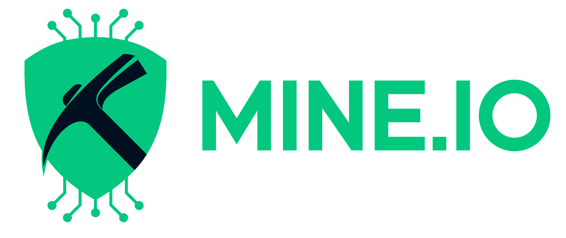
Logo is based on three symbols – a pickaxe (in reference to mining), a shield, referring to safety, security and environment protection, and the PCB paths that connect us to the Industry 4.0.
We also emphasize the modernity and innovation of the design, using simple typography and a color scheme associated with the technology industry – a combination of navy blue as the base color with a shade of blue and light green, that refers to sustainability and eco-efficiency.
By providing compelling visuals, the project aims to attract new partners, investors, and stakeholders, who are committed to the development of innovative solutions in the mining industry.


